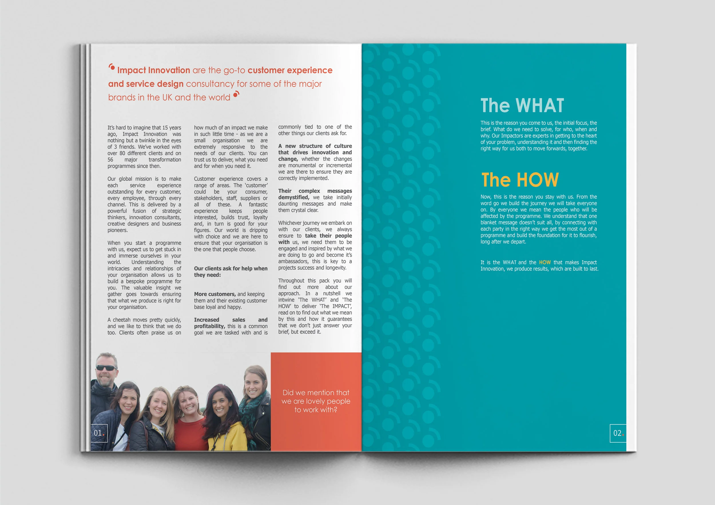
Impact Innovation rebrand
For their 15th birthday Impact Innovation were after a rebrand. With their company focus streamlined to customer experience, I carried this forward in their rebrand, lifting their visual identity.
My aim was to give Impact more of a grown up look and to make their new logo and brand assets work for them in digital media as well as in print. With the word ‘impact’ being in their name you would possibly expect it in capitals and screaming out at you to illustrate the word. After our initial branding session we discovered that they wanted to focus on their friendly approach rather an ‘intrusive’ impact. This is why the logo is soft and rounded, but finished with squared caps to the letters to show that they do have that hard hitting edge to them. A full stop was incorporated into the logo to serve as a message telling people to ‘look no further’ than Impact Innovation.
A change in colours dramatically changed the feel of the company, this palette was chosen to reflect their previous colours, but with more sophistication. I produced patterns, which are to be used on all materials and further strengthen the brand - you see them in use in the images above on the website and introduction pack. There is a focus on ‘perfect’ shapes, an example being, circles as opposed to ovals.
Once their brand identity was established, the new website was designed and built to be clean, clear and serve as a top level view of Impact Innovation and what they do.


