YMCA
Here is a concept rebrand for YMCA England.
The Young Men’s Christian Association (YMCA or also known as the Y) is a worldwide organisation. It’s identity varies a lot between countries, the American reference to it as ‘the Y’ is very strong. No longer being centred around men, or Christians it feels strange to hang on to the ‘M’ and ‘C’. I have read that YMCA England didn’t want to shorten themselves to ‘the Y’. Their identity was updated a couple of years ago, but here I would like to show a solution I have come up with.
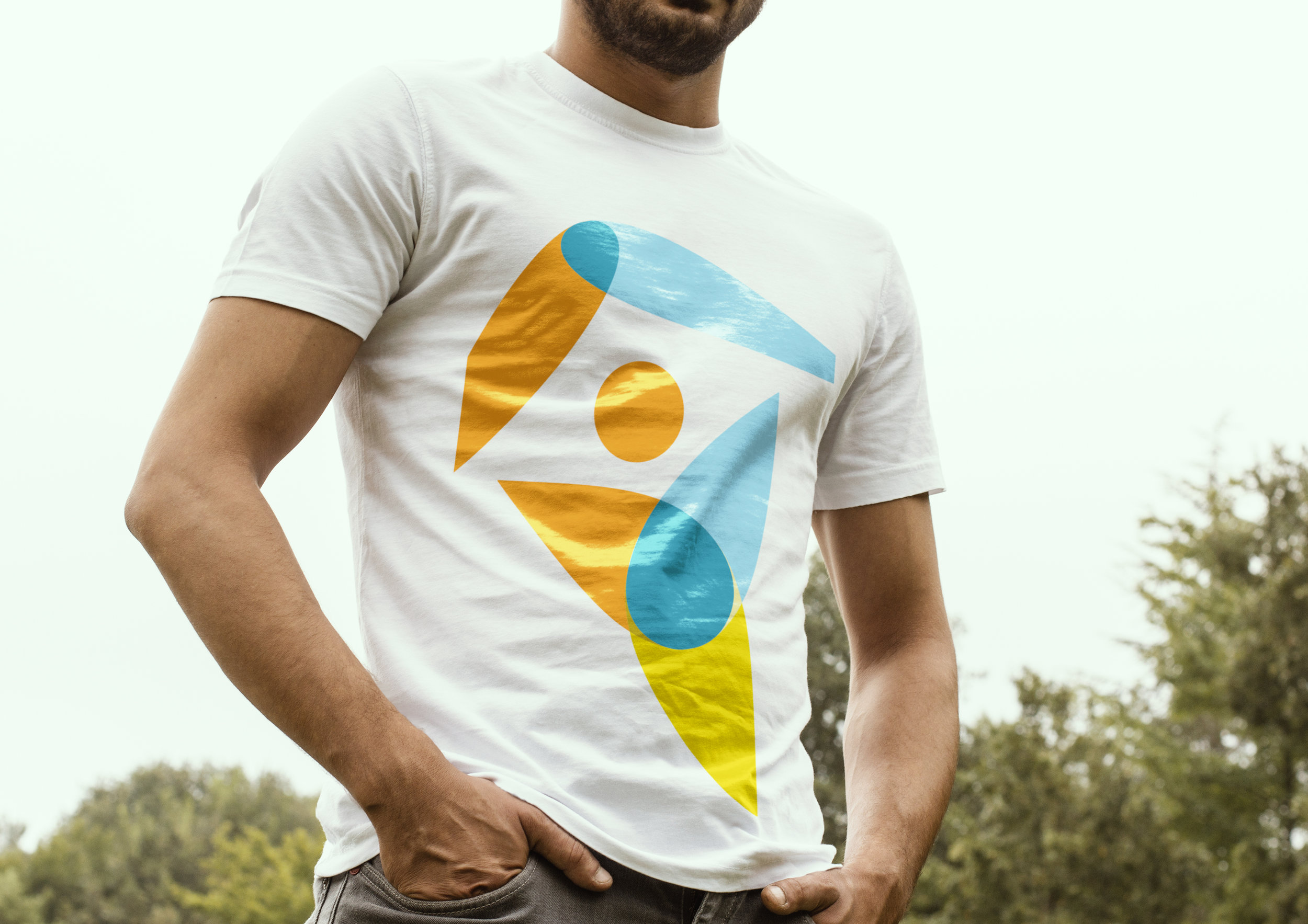
My logo works with overlapping the same shape to make up the letters YMCA, when the shapes overlap they blend and produce a new colour. My reason for doing this is to show that, at the YMCA people come together and help you to move forwards and strengthen yourself. This results in a colourful and playful logo.
Each letter has a certain human element to it. The ‘Y’ is the most obvious, a happy person with their arms flung in the air, safely situated under a roof as the YMCA has a strong association with shelter. The ‘M’ is two people shaking hands, to show the YMCA will help you move towards gaining skills and employment. ‘C’ is a top down view of someone holding their arms out ready to give someone a hug, to signify that you will receive support. Lastly the ‘A’, is a nod towards the Christian roots of the organisation, this letter is someone knelt, praying.
It is the ‘Y’ with the roof that I have taken forwards to use on materials, as it creates a sense of fun and positivity. With the other letters being stripped away it is a lot more direct and has more of a modern feel. I want this to be a brand that people would be proud to wear, talk about and if they are willing, get involved and help out others who aren’t as fortunate.


