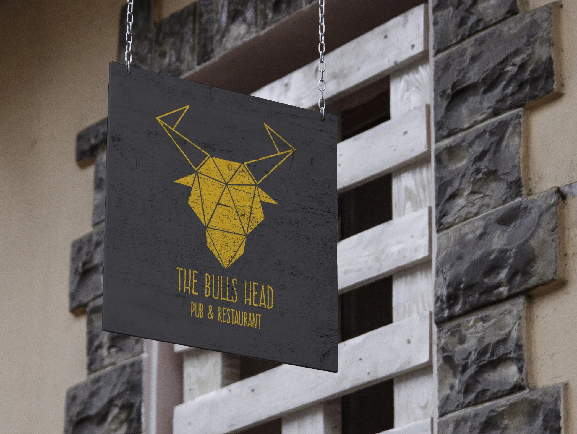
The Bulls Head
Here is a concept rebrand for a pub situated in a very affluent part of Surrey.
The rebrand reflects this with its clean, sharp graphics, whilst retaining a homely feel by using the uneven, handdrawn font. The logo steps away from the traditional pub sign. It is centred around a bull’s head which stands alone, and in no way looks realistic, but stylised, simple and gold.
The pub is well known for its excellent food - it is the main draw for new and returning customers. The menu is clean and straight forward. The detail is displayed elsewhere in the pub through textures - in all natural furnishings. Leather and wood dominate the space displaying quality and comfort, the smooth of the leather sits in contrast to the grain of the wood, and the stone lining the windows.


